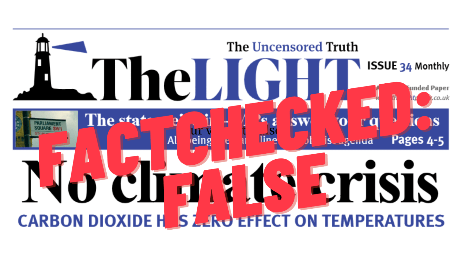
Is The Light telling us the truth?
“It was a real shock to find that they had tried to trick me. And they had also lied” – Andy Williams picked up the June issue of “The Light” and looked into their front page story. The front page of Issue 34 of “The Light” claimed in its headline there is “No climate crisis” and “Carbon Dioxide has zero effect on temperatures” and presents two graphs in an attempt to back this up. In the piece that follows Andy outlines his investigation into the claims and graphs presented:
I’ve been hearing a lot about The Light recently, so I decided to give it a try. I’m a sceptical reader, fact-checking everything that seems a bit odd. The article at the very top of the June issue really caught my eye.
That there is apparently “No climate crisis” was really big news to me. The science of “global warming” – how carbon dioxide tends to stop heat from the earth escaping off into space – has been accepted as fact for more than a century. So “The Light” would have to have good evidence to show that it’s not true.

The “uncensored truth” – or hiding data?
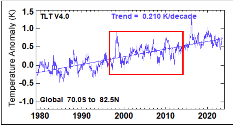
The front page of Issue 34 of “The Light” used a compelling looking graph to back up the headline claim. The graph showed that despite CO2 levels rising for a 17 year period, the surface temperature of the earth has stayed about the same. It cited data from a website called remss.com – associated with Remote Sensing Systems, which “provide[s] research-quality geophysical data to the global scientific community”. Unfortunately, when I tried to follow this up, the link provided didn’t really work. A little digging uncovered that they were using the data associated with the graph below. This shows the temperature of the lower troposphere – not the surface temperature, as claimed.
The full graph from the remss paper shows data from January 1979 to June 2023. Across this time period a trend line shows an overall warming trend in the troposphere of 0.21°C every ten years. That is a high rate of warming.

The version of this data in “The Light” (shown below) only shows 1997-2013, however. Those making the chart have deleted the cooler periods before 1997 and the much hotter times after 2013.

The two graphs don’t look at all similar until you realise that they have chosen just to plot the bit of the original graph in the red box.
It was a real shock to find that they had tried to trick me. And they had also lied. The full graph (and the article explaining it) shows that carbon dioxide does have an effect on temperatures.
This was not a mistake
This was not a genuine mistake by the authors of The Light. They must have hunted hard to find this graph. Then they went to the trouble of replotting just the segment of it which made it look as if temperatures are falling, then they added CO2 emissions and mislabelled the whole thing. They know that temperatures are rising due to greenhouse gas emissions, but they are trying to prove the opposite.
Text underneath the chart commands readers to “Ask those pushing… to explain this”. It is very easy to. The chart is an example of a classic disinformation tactic known as ‘cherrypicking’ – deliberately selecting/excluding data from a larger dataset in order to misrepresent the evidence. “The Light” use the strapline “The uncensored truth” to describe their paper… but on this occasion they have deliberately “censored” the full data.
More cherrypicking
The Light also featured a second graph. What about that one?
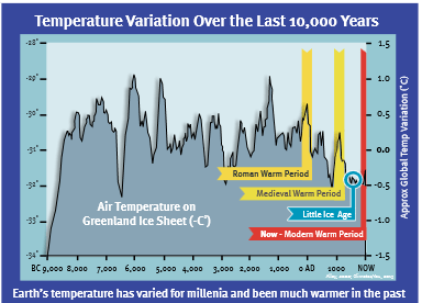
According to the graph, the temperature over Greenland has varied between -29° and -34° over the last 10,000 years and is now actually a little colder than average.
This graph was published in 2008 and versions of it have been widely used by climate sceptics. The Carbon Brief website provides a helpful article on the misuse of this data, with background on how such long-term data regarding temperatures is collated. They explain:
versions of the graph have, variously, mislabeled the x-axis, excluded the modern observational temperature record and conflated a single location in Greenland with the whole world.
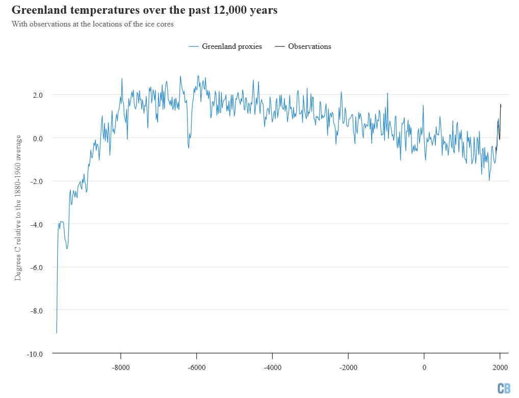
More recently, researchers have drilled numerous additional ice cores throughout Greenland and produced an updated estimate past Greenland temperatures.
This modern temperature reconstruction, combined with observational records over the past century, shows that current temperatures in Greenland are warmer than any period in the past 2,000 years.
An accurate and up to date graph is in the Carbon Brief article referenced above, and is included below. The recent rapid heating is clearly visible at the right of the image covering observational records since the year 2000. Carbon Brief summarise this by saying “Recent temperatures are clearly higher than any seen in Greenland over the past two millennia”. They acknowledge that “they are likely still cooler than during the early part of the current geological epoch – the Holocene – which started around 11,000 years ago”, but emphasise that “warming is expected to continue in the future as human actions continue to emit greenhouse gases, primarily from the combustion of fossil fuels. Climate models project that if emissions continue, by 2050, Greenland temperatures will exceed anything seen since the last interglacial period, around 125,000 years ago.”
The big problem with the graph used in Issue 34 of “The Light”, below, is that it does not go up to “NOW” as suggested on the axis. It only goes to 1950, so recent rapid warming – associated with greenhouse gas emissions – is not shown.
A second problem with the graph in “The Light” is that it presents a single ice core record from Greenland as representing all (global) “Temperature Variation Over the Last 10,000 Years”. As Carbon brief explain “Any individual location will have significantly more variability than the globe as a whole. A single ice core is also subject to uncertainties around elevation changes and other perturbations to the ice core over time.” The chart they present which we introduced above instead combines data from six Greenland ice cores.
Why did “The Light” pick Greenland? The graph below shows the world’s longest archive of observational temperature records – the central England temperature record, which covers the last 360 years. Temperatures are clearly going up. As well as 2022 being the hottest year so far in England, the graph also highlights how much more common it is for a year to exceed the 1961-1990 average. You can find this chart and an explaination of it on the Met Office website.

At the global level, the graph below shows one of the largest reconstructions using multiple proxies for past temperatures. It is from the Past Global Changes (PAGES) project, “a collaboration between thousands of palaeoclimatologists from 125 different countries, who published a thorough analysis of global surface temperatures over the past 2,000 years – called the PAGES 2K project”. The red line shows the rapid rise in observed global surface temperatures after 1850. You can find this chart on a Carbon Brief webpage discussing “How ‘proxy’ data reveals the climate of the Earth’s distant past“.

Global warming is happening
The front page of “The Light” was interestingly time. The month it was published, June 2023, was the hottest on record according to scientists from the US National Oceanic & Atmospheric Aadministration (NOAA). Heatwaves affected Europe, Asia, and North America, with record-breaking wildfires in Canada affecting 10 million hectares – equivalent to the area of the whole country of Portugal. Meanwhile, devastating flooding affected India, Japan, China, Turkey and the U.S.
The average global surface (land and ocean) temperature in June [2023] was 1.89 degrees F (1.05 degrees C) above average, ranking June 2023 as Earth’s warmest June on record.
June 2023 was 0.23 of a degree F (0.13 of a degree C) warmer than the previous record set in June 2020. June 2023 also marked the 47th-consecutive June and the 532nd-consecutive month with temperatures above the 20th-century average.
From the NOAA
Why is “The Light” lying to us?
If the authors of The Light are correct – that carbon dioxide has no effect on temperatures, and there is no climate crisis – why are they relying on graphs so easily shown to be misleading? There should be loads of solid evidence to back up their claim. Instead they have to cherry-pick bits of data, or show old, incomplete graphs.
The authors know they are publishing misinformation. Finding bits of graph to back up their assertions means reading through reams of papers and viewing graphs that show that global warming is happening.
Perhaps the editor has been deceived, rather than publishing misleading graphs deliberately. But if the paper really is the “truthpaper” it describes itself as, shouldn’t he have checked the charts showed the full “truth”? What other mistakes has he made with regard to evidence on other topics if he was willing to overlook the obvious ones here? Denial of climate change is a consistent theme in “The Light” paper (as we wrote about last year). Yet nearly all scientists – people who spend their working lives trying to discover the facts, and examining the evidence – say we are facing a climate crisis.
We might not like it, but that doesn’t mean we can escape reality by relying on dogy graphs.
We have to ask: why is “The Light” lying to us?
You might be interested in further information on how CO2 and other “greenhouse gas” emissions affect global temperatures – and increasing emissions lead to global warming. The following discuss this in more detail:
“Global temperature and CO2 levels are correlated and both have risen overall since the late 1880s, according to researchers… The greenhouse effect has repeatedly been verified in experiments since at least the 1800s” (from “Fact check: Global temperatures and atmospheric CO2 levels are correlated, contrary to claim”)
“How do we know more CO2 is causing warming?” (from skepticalscience.com)
A video cited at the above link which explains the basic physics and chemistry involved in understanding how CO2 effects global temperatures, and the long history of evidence around this:

As the oceans heat up due to natural cycles:, more Co2 is gradually released. Co2 lags temperature change, this is well known fact:
https://www.newscientist.com/article/dn11659-climate-myths-ice-cores-show-co2-increases-lag-behind-temperature-rises-disproving-the-link-to-global-warming/
LikeLike
have you read that article in full? Have you even read the subheader? “it does not in any way contradict the idea that higher CO2 levels cause warming”.
Later in the same article: “We know that CO2 is a greenhouse gas because it absorbs and emits certain frequencies of infrared radiation. Basic physics tells us that gases with this property trap heat radiating from the Earth, that the planet would be a lot colder if this effect was not real and that adding more CO2 to the atmosphere will trap even more heat.”
(and yes, we also saw that New Scientist piece quoted by The Light in their recent issue. That they obviously haven’t bothered to read it let alone think about it long enough to understand it makes completely the opposite point to what they hoped it does, is characteristic of their entire approach to evidence and sources)
LikeLike